Role
UX Researcher & Designer
Timeframe
Fall 2025 Semester
Platform
Mobile App
Team
6 UX Designers
Overview
WalterPicks is an app used to gain fantasy and betting insights while leveraging machine learning to deliver smarter decisions. Users can link their different betting accounts to access accurate predictions, actionable advice, and expert insights to enhance their fantasy and betting experiences.
I joined this project as part of Purdue’s Experience Studio course, where our six-person team was tasked with evaluating and redesigning WalterPicks’ game betting and player prop evaluator (PPE) interfaces. While the app offers powerful individual tools, the current design lacks integration between them. My goal was to help bridge the gap between what the technology could do and what users could actually understand and use.
Problem Space
Central Question
How might we redesign the UI to emphasize its core betting features and deliver a cohesive, seamless experience?
User Group
Sports fans and sports bettors (ages 18+) with varying levels of experience who utilize digital platforms to place wagers.
Core Issues:
• The Player Prop Evaluator and Game Betting features felt like disconnected experiences rather than parts of a unified platform.
• Users were confused by terminology like “EV Edge,” overwhelmed by information density, and unable to differenciate different screens.
• The lack of visual hierarchy and intuitive labeling meant that even experienced bettors were struggling to extract information from the app’s core features.
Research
01
Literature Review
02
App Store Review
Analysis
03
Comparative Analysis
04
User Interviews
(Round 1)
05
Usability Testing
(Current State)
Literature Review
I started by immersing myself in the psychology of sports betting. Our literature review surfaced key behavioral concepts that would later inform our design decisions.
Takeaways
Learned about terms such as loss aversion, which drives users toward small bets with better odds, as well as confirmation bias, which means bettors rely on prior intuition and agreement over raw data.
These insights helped me understand that our design needed to prioritize scannability and give high-confidence metrics upfront, rather than burying users in hard-to-read data.


Click to View
Ideation
Round Robin Sketching & Low/Mid Fidelity Mockups
We kicked off with a Round Robin Sketching session, rotating sketches every two minutes so each team member could build on others’ ideas. This exercise produced a set of group-annotated concepts that directly fed our wireframes.

Key Ideas
Dropdown filter for sports categories.
A wider search bar spanning the full width.
Player profile pictures added to prop cards for faster scrolling.
Simplified footer for more intuitive navigation
Game/Player toggle to switch between central screens
Developing User Personas
Drawing from our interview data, I helped create three user personas that captured varied segments within WalterPicks’ user group. We focused on differences in experience level, betting motivations, information sources, and pain points. These personas guided our design priorities and helped us evaluate whether our solutions served different user types:

Mitchell Grant
Our ideal user, 27-year-old sales representative, frequent WalterPicks user, data-driven, motivated by profit. Wants quicker navigation and prioritized insights for efficient bets.

Brad Cheddar
22-year-old college student, experienced bettor but not yet a WalterPicks user. Motivated by social competition, needs reliable analytics and efficient workflows to balance betting with school.

Jonah Jones
32-year-old data scientist, WalterPicks user focused on fantasy football. He wants comprehensive league views and optimal lineup recommendations, but only uses the app seasonally.
Iteration
Second-Round User Interviews
The WalterPicks sponsor provided a list of their own users willing to give feedback, allowing us to gain new insights using a modified version of our original protocol, adding a ranking activity and more specific questions. The interviews generally confirmed that the current user base was predominantly conservative bettors who preferred betting on favorite teams and valued simple interfaces.
Concept Testing
We tested two major design concepts: a Toggle design (Game/Player switch at the top of a single Betting screen) versus a Non-Toggle design (integrated game and player data on the same page). Participants favored both approaches for different reasons: the Toggle reduced visual clutter while the Non-Toggle provided a familiar flow. We ultimately chose the Toggle design for its cleaner hierarchy.


Final Designs

Main Page
Unified Betting Page with Game/Player Toggle
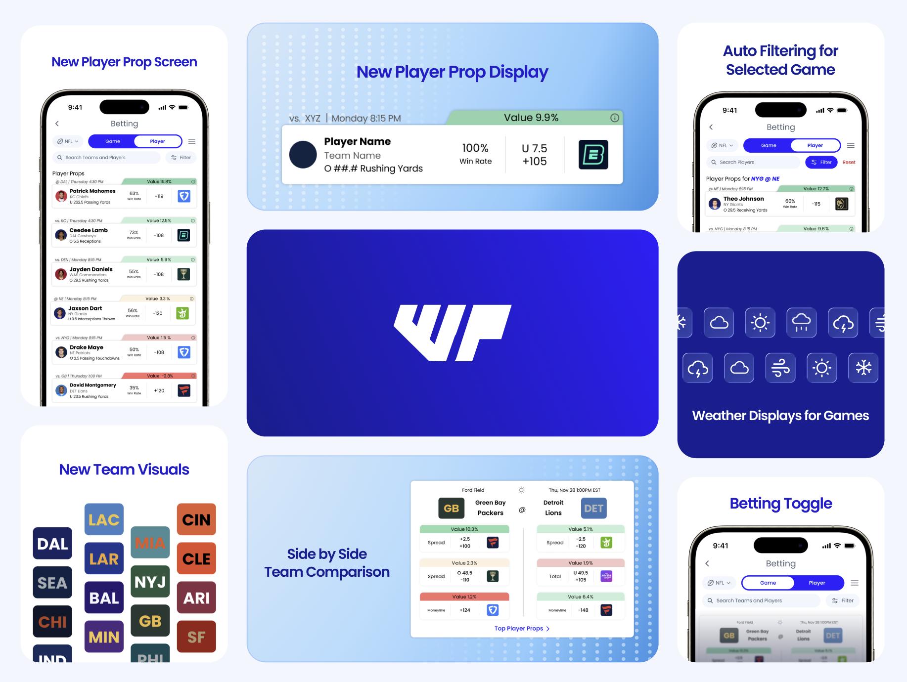
The original app treated Game Betting and Player Props as entirely separate flows, creating a disjointed experience. The redesigned Betting page features a prominent Game/Player toggle at the top, allowing users to switch content with a single tap.
Vertical Card Layout for Game Betting
Our initial testing revealed that users felt overwhelmed by the horizontal, dense layout of the original betting screen. We implemented a vertical card layout that presents each matchup as a distinct card with teams displayed side-by-side.
Player Prop Cards
Player and Team Displays
Player headshots and team logos were added to each card, as our research determined that increasing visuals to reduce cognitive load. Users can quickly identify players and teams without reading every line of text.
Refining Terminology
“EV Edge” was renamed to “Value" to clear up confusion, and moved to a high-visibility tab on the top of each card. This ensured that that most important metric was understandable and easy to see


Filtering
Auto-Filtering for Selected Games
Added a simple filter system that allowed users to sort by games or individual athalete matchups. A blue banner confirms that the filters are active.
Enhanced Search and Filtering
An enlarged search bar now spans the full width of the screen, with dedicated filter and sort options. This helped users wanting quick access to specific players or matchups without scrolling through the entire list.
Visual Additions
Weather Icons and Contextual Data
In our interviews, users heavily requested the addition of weather information, therefore, small weather icons were added to game cards to provide at-a-glance information for coming games.
Scalable Team Visual System
Instead of sport specific assets like football helmets or basketball jerseys, we designed color-coded rectangular blocks with team abbreviations. This universal visual language scales to all sports without requiring unique design assets for every league.

Reflection
Never Slack On Research
I learned that research is not optional, it’s the foundation. Every major design decision in our final prototype traced directly back to a specific research finding. The lit review built our initial understanding of betting psychology and terminology, the usability testing gave us a list of specific pain points, and the concept testing validated our designs with real users. Without research, we would have been designing based on assumptions and wouldnt be able to provide evdence for our work.
Emphasis on Jargon
Coming into this project, our group had very little familiarity with sports betting terminology, from sports statistics to betting-specific jargon. We found that dedicating time during the first week to researching key concepts such as player props, moneylines, and over/unders gave us a stronger foundation and allowed us to work much more efficiently with the app throughout the project.
Next Steps
Given more time, I would have loved to expand this project to other core features of the WalterPicks app, particularly its fantasy insights. Given the success of our work in creating a more cohesive betting experience, I believe the rest of the app could benefit from a similar redesign focused on both visual consistency and user flow.
